
Our benefactor wrote:
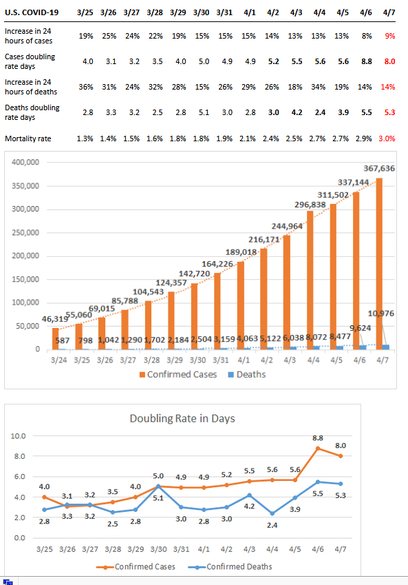
You can visibly see the trendline in the bar chart starting to curve. (A doctor) and I were discussing what flattening the curve means from a data perspective. Most graphs are log graphs. Ours is a linear one. From his, a doctor’s perspective, flattening would be the number of cases showing up at the hospital every day. In that sense, nationally, we’re right there. It varies from state to state.
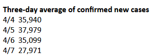
I did a three-day average for new (usually tested) cases, and we’ve peaked over the last two days. Hopefully, that trend continues. It’s hard to tell, because the daily numbers are much more erratic.
Seems like good news. Remember that all of this is on a delay, people walk around without symptoms, then get symptoms, then they get worse and they go to the hospital and usually that’s when they get tested unless they’re important. You can see something similar in the doubling rate for cases vs. deaths: The cases doubling rate peaks eight days before deaths–people get to the hospital, then it takes them some time to die.
If this is the peak, it’s far better than it could have been. Do remember that there’s a long tail even if it is brought down, and even if there’s good testing (like in South Korea). In the US, there may well be multiple peaks.
Still a ways to go.
In other news, UK Prime Minister Boris Johnson is in the hospital and has been intubated. At this point his odds of survival are about 30%, and being on a ventilator sometimes does long term damage, including to brain function.
Boris, of course, deliberately shook hands with infected patients and his original plan for Covid-19 was to not bother with self-isolation. It’s safe to say that his delays will probably be responsible for perhaps a couple thousand avoidable UK deaths.
I dislike anyone suffering, so I hope he’s well-sedated. Ventilators, having had one in briefly in my 20s for surgery and afterwards, feel unbelievably bad. It’s not an exaggeration to say I have lived a life filled with massive pain and suffering, sometimes at levels that pain killers couldn’t deal with, but I think having that ventilator breathe for me may top the list.
The results of the work I do, like this article, are free, but food isn’t, so if you value my work, please DONATE or SUBSCRIBE.
anon
No sympathy for Boris Johnson. Unlike most of us, he received a test and is being provided with excellent health care above and beyond what a normal person would receive. This is a man who promoted herd immunity at the start of the coronavirus crisis and used his power for evil with plans to make cuts to the NHS. He has no sympathy for million of other people dying from health problems, so why should we care about what happens to him? If he dies from COVID-19 it will be from his own stupidity and ignorance. I would call it karma, but unfortunately, he will have killed thousands of other innocent people along with himself.
Jeff Wegerson
The purpose of a log scale is to make it all fit on one sheet of paper and still see the trend.
We’re no out of the woods as flattening the curve means a long time near the top. That’s what is happening now in Spain.
In cases per million the US is almost exactly like Italy\’s curve. Both linear and log scale
Stormcrow
Something you may recall if you took a couple of semesters of calculus:
A 2-dimensional curve passes through an “inflection point” when it’s concavity inverts: concave up to concave down, or the reverse.
If the function that generated that curve is always twice differentiable, throughout the region of interest, that’ll happen when the second derivative passes through zero.
On a linear plot, you can see an inflection point fairly easily. If you look at South Korea’s “confirmed case” plot, you’ll see that something like this happened near March 2.
Whether we’re approaching this point or not isn’t clear from the data:
○ The data in this case is not being generated from a twice differentiable function, for sure and for certain: integer-valued functions aren’t even differentiable once when the value of the function changes because it’s always a step discontinuity.
○ And furthermore, the data is “noisy”, as Ian’s friend has pointed out.
Look again at the SK data and you’ll probably agree that the exact time of the inflection point isn’t really clear. It could be March 2, but there’s a day or two’s worth of uncertainty. The only way we can be reasonably sure, is by hindsight, once we’re a week or so past that point.
The next thing to look for will be the point where the “active case” plot maximizes and starts to fall. SK’s active case maximum seems to have happened about a week and a half after inflection point: March 11.
Stormcrow
Jeff:
There’s another reason log plots are used for things like this.
On a log plot, exponential growth and exponential decay both look like nice straight lines. So it’s easy to diagnose them.
On a linear plot, human eyes and brains just see the increasingly steep rise or fall. They don’t easily see its exponential nature.
gnokgnoh
Stormcrow, it’s been a few years since my calculus course in college. I agree with you about needing to observe the trend for longer than a few days. I noted that the data are still quite noisy. Nonetheless, I started with a linear plot for a number of reasons. It feels quite tangible to me.
A log plot does not. I’m not even sure what triggers exponential decay – I assume when the number of new cases starts decreasing? I do know that the straight line smoothing is great for forecasting, especially when it peaks, but the very tiny inflections in the log plot appear almost imperceptible. From a lay person’s perspective, this is quite abstract.
All that being said, I really appreciate your comments, and you have forced me to torture my son with questions about calculus and statistics.
Z
If Boris Johnson, who prodded for herd immunity and then got trampled by it, survives COVID-19, the media will play it up as an heroic feat … “Churchill of the Coronavirus” above a photo of Boris himself with a reassuring grin and two thumbs up … when the entirety of it ought to be told in the same sober, flat tone as a story about a poacher who survived a goring he took from an animal he was illegally hunting in a game reserve.
Z
profan
Do you have a link for intubated? The news seem to highlight he is not on the vent.
metamars
Cuomo is evil. He CAN’T be this dumb:
From:
“Well, I’m Upset” – Dr. Oz Vents After NY Governor Cuomo Shuts Down His Study On “Hydroxychloroquine For Early Treatment Of Coronavirus (VIDEO)”
I knew that Cuomo had banned use of HCQ outside of hospitals, but I had assumed Oz’s study would be on an outpatient basis, but run through a hospital.
I’m pretty sure this is for a trial with randomized treatments (and probably double blind), to suit the purists who pretend something isn’t real if it hasn’t been shown with this standard.
I’m curious as to whether his motivations are to placate dysfunctional medical/pharmaceutical types; or else because he’s on Team Democrat, and wouldn’t want Trump to be able to prove his point, least of all with American data. He’s evil, either way.