
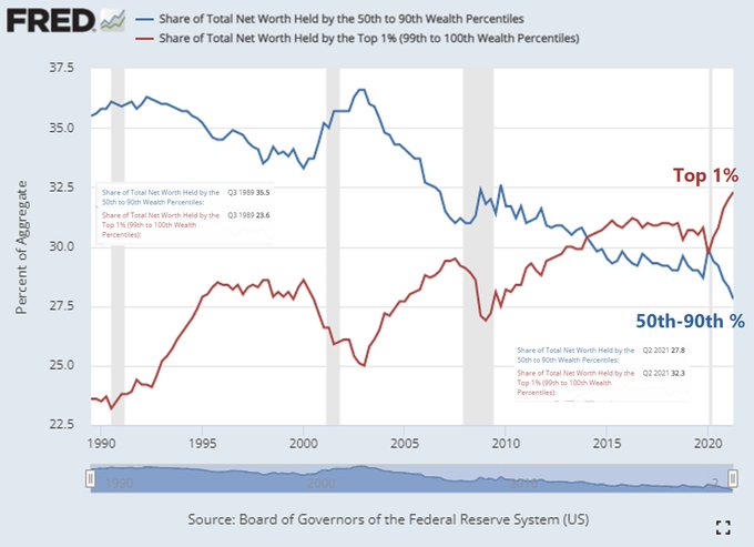
Rudy Haverstein noticed this one. It used to be that the top 1% wealth exceeded the wealth of the 50-90th percent (the middle class) about ten years ago. Here’s that old chart:
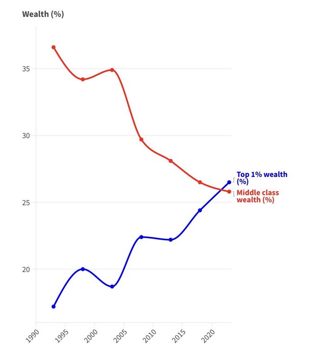
Then some statistical changes were made:
“The Fed attributes the changes to “Distributional Financial Accounts models updated for the 2023Q3 release.” I’ll note that – as with CPI – I’ve never seen data revisions that made the situation look worse, always better. ”
Now the top 1% only recently surpassed the middle class:
I bring this up because too many people believe that economic stats aren’t fiddled. They’re heavily, heavily fiddled. I consider CPI essentially worthless.
This has turned into a massive debate: most Americans think the economy sucks, but if you look at economic stats Biden is the greatest economic president since FDR. But that’s based on CPI being what the BLS says it is. And the CPI, after decades of manipulation, is garbage.
A Federal Reserve study on household finances found that Americans outside the wealthiest quintile have depleted the extra savings generated early in the pandemic and now have less cash on hand than they did when the pandemic began.
If manipulating a statistic is useful to those in power, it is manipulated. When I first started blogging, I used to cover Bureau of Labour Statistic releases every month. I had spreadsheets full of stats. Now I don’t, because Garbage In, Garbage Out. (GIGO.) In truth, even back in the early 2000s the stats were terrible, but it took me some time to figure out how divorced they were from reality, and that divorce has widened since.
Instead I try and look at real numbers: reported retail prices and wholesale prices and actual rents and so on. There’s some unavoidable use of official statistics, but they’re only really useful comparatively, and even then one has to be careful, due to constant revisions, including backwards revisions.
One recent stat is that Russia has been growing faster than the G7. Is this true? Well, I think so, for a variety of reasons, but it’s only a probability. China definitely is, because I see vastly expanding industries all over the place, enough to make up for the deliberately engineered real-estate collapse.
Don’t believe internal numbers. Cross check your personal experience with the experience of other people and believe that. Even if you get it wrong, in a sense you’ll get it right: are prices much higher for you and those you know than they were pre-pandemic, or not? Has your income and those you know risen faster than those prices?
That’s your personal economy.
I have often thought that if I were suddenly in charge of any major country, practically the first thing I’d do would be to form my own corp of auditors, reporting only to me, and the first thing they’d do is savagely audit the statistical agencies, followed by mass firings and re-formation.
Because if your statistics are bullshit, it means you can’t really know what’s happening. And if you don’t know that, well, you can’t make good decisions.
Under our current regime that isn’t a problem: they don’t want to make good decisions, they just want statistical support for pre-determined neo-liberal decisions.
And that’s why they’ve spent 50 years running the economies off the West into the ground.
You get what you support. If you like my writing, please SUBSCRIBE OR DONATE
Oakchair
—
If manipulating a statistic is useful to those in power, it is manipulated
————
It might be quicker to list manipulated statistics that wouldn’t be useful to those in power, verse listing those that would be.
One possible way to spot manipulated statistics is when two statistics conflict which each other.
Example 1:
7% of young Americans had a chronic illness in 1980, now around 60% do Yet according to the statistics life expectancy has increased.
Example 2:
2020: 3.4 million
2021: 3.5 million
2022: 3.3 million
Increased deaths in 2020 were driven by old people dying while increased deaths after 2020 has been driven by young people dying. Yet according to the CDC life expectancy increased from 2021-2022.
—-
if your statistics are bullshit, it means you can’t really know what’s happening.
—–
For the oligarchs that is a feature instead of a bug.
jemand
Huh — I was not expecting to find that the first comment here to reference life expectancy, which is what I ALSO wanted to mention! There’s an increasing acceptance that economics data has been massaged, but many people who admit that still believe other types of official data, like life expectancy calculations.
I’d gotten curious last fall as the provisional life expectancy report was so significantly delayed from when it had been released the previous year, and I started to wonder why that might be so. What could they be DOING with all the extra time?
At first, life expectancy seems a simple calculation to do. Just calculate “number died at age” divided by “number of people of that age in region” and find the midpoint (or whatever.)
But then I started thinking about how documentation of the above can change based immigration trends, people dying while traveling, fetal age estimates & the line between a counted “stillbirth” death vs uncounted miscarriage & whether any of that birth-side of the story might have changed in abortion-illegal states, etc. Everything started to get extremely complicated and very possible to massage if desired. (And of course they desire it.)
I decided to look at the actual reports– provisional vs final life tables for 2021– and found that the final version and provisional version were quite different!
Calculation for 2020: 77 years
Calculation for 2021, in report published August, 2022: 76.1 years
Calculation for 2021, in report published December, 2022: 76.6 years
In other words — the drop recorded in August was .9 years from prior year, vs .6 years in the later publication. This seems pretty big, to me!
The reason? The mid-year report had to rely on vital statistics (which I assume is simple count of death certificates), while the end-of-year report had gotten the year’s Medicare data.
In fact, they increasingly weight the Medicare data vs the vital statistics data as ages increase, & above age 85 they start literally using logistic regression model instead of actual data. I’m curious what this means for reality on the ground, given that from what I understand, Medicare requires citizenship or at least bureaucratically sanctioned residency. It also really makes me wonder things when they state that the majority of that extra 0.3 years found in December vs August comes from ages where a model, rather than observed death data, is being used.
Note — non-resident deaths are *EXCLUDED* from the life tables — makes sense, I guess, it’s hard to really figure out how deaths of tourists really relates to life expectancy. But consider how that reasonable principle can be used to massage statistics. If previous demographers counted long-term residents in the death rates, but later ones started excluding more and more of the undocumented, migrant, or homeless populations you have a situation where a previously counted, less healthy population, was now removed from the reported values, making them artificially look BETTER than they would have if nothing had changed in death rates on the ground.
However, I’d expect those vulnerable populations to be the MOST impacted from covid, meaning that this sort of data trickery will be even more effective.
At the end of my data dive, I had a pretty strong hypothesis on why the provisional report was waiting so long to be published last year, and I also had significantly less trust in the final reported values.
Reports:
https://www.cdc.gov/nchs/data/nvsr/nvsr72/nvsr72-12.pdf
https://www.cdc.gov/nchs/data/vsrr/vsrr023.pdf
Ian Welsh
If you want to know actual life expectancy, look at the actuarial and underwriting tables used by life insurance and annuity companies (but especially life insurance.)
Oakchair
“death rates (in) those 18 to 64-years-old – are up 40 percent in the third and fourth quarter of 2021” —OneAmerica, an Indiana-based life insurance company
For the 5 largest life insurance companies in the US the total Ordinary death payments they gave out by year.
2021: 18.6 billion
2020: 16.4 billion
2019: 14.8 billion
2018: 14.2 billion
https://thehighwire.com/news/5-largest-life-insurance-companies-in-u-s-show-increase-death-payouts-in-2021/
Anyone think this has anything to do with a vaccine that 75% of the population got? You know the one where the corporation’s own clinical trial showed it increased severe adverse events and mortality by 65% and 24% respectively?
Ian Welsh
Or maybe there was a pandemic at the time? Or maybe some of both?
mago
Someone dropped a bomb somewhere contaminating atmosphere and blackening the sky/have you heard the news?
It’s good news week. . .
Lyrics from the 60’s.
Doesn’t matter.
Graph this and graph that.
It’s all a graphic display of a dysfunctional shit show.
And the beat goes on . . .
Oakchair
Or maybe there was a pandemic at the time? Or maybe some of both?
———————
Maybe one also made the other worse?
I’d say all three are true.
Worldwide Covid vaccines are associated with increased rates of future Covid infections (figure 1).
https://www.ncbi.nlm.nih.gov/pmc/articles/PMC8481107/
The Cleveland Health systems study found a dose depending relationship where each additional Covid vaccination was associated with an increased chance of being infected with Covid. The group with 2 dose had over 2 times more Covid infections then the group with 0 (Figure 2).
https://academic.oup.com/ofid/advance-article/doi/10.1093/ofid/ofad209/7131292
This paper found every 800 Covid vaccines killed 1 person. This comes to around 1.2 million deaths for America which is roughly the amount of excess deaths since the vaccines became available.
https://childrenshealthdefense.org/defender/covid-vaccine-rollouts-all-cause-mortality/
This would not be the first time modern medical treatments turned out to be extremely deadly and worsened the conditions they were said to treat. Nor the first time the medical industry lied, censored and denied it to protect their interests.
I recall you read and posted about Robert Whitakers book showing psychiatric drugs cause worse outcomes.
https://erenow.net/common/anatomy-of-an-epidemic/
Carborundum
One of the things that I have noticed over the years is that the people who are most prone to call bullshit on national statistics are those that have something to gain from the perception that they are right while national statistics are wrong. This is particularly true when making the assertion that those statistics are being manipulated. Ending up in an analyst-consumer feedback bubble is probably the most pernicious threat of the trade at present and checking against a range of external markers is pretty critical. Unwillingness to test one’s product (and particularly one’s worldview) against external falsifiers is the number one reason why I’ve fired or, more commonly, refused to work further with people over the years.
The bottom line on most of this – and I say this as someone with decades-long relationships with our national statistics agency – is that one has to read and understand the documentation for every platform and estimate one uses. If one does that, maintaining appropriate appropriate skepticism around random variability, they’ll be a lot further ahead than the person who takes the emotionally comforting cognitive shortcut of declaring all of it bullshit and adopting their perceptions as The Truth [tm].
My view, the issue is far less one of estimates being cooked than it is a combination of people not understanding what the estimate really measures (as opposed to what it purports to measure, and more particularly what commentators assert it measures) and the sheer complexity of constructing many of these estimates. In addition to substantially no one reading the documentation (and fully understanding the baseline variability of estimates), most folks access the data one point estimate at a time, doled out by secondary parties (media, bloggers, bureaucrats, politicians, etc.) who all have potent vested interests in keeping the data consumer dependent on them. (They also specifically want to keep the audience data consumers rather than data users, but that’s a perspective for another day.)
Are national statistics frequently out of step with personal perceptions? Absolutely – and sometimes that is because those statistics have errors. However, in the intensely fragmented modern dis-intermediated world, rife with easy self-selection and algorhythmic reinforcement of silos, one needs to constantly be on guard against confirmatory bias. Are things really that bad / good or are you in a market that responds better to negative or positive stimulus? My view, the vast majority of the issue is that dynamic and only a small minority is attributable to national statistical error.
Forecasting Intelligence
Hi Ian,
Its even worse than that.
Our ruling elites actually believe their own garbage stats (it helps they are so wealthy they are largely insulated from the reality of a declining economy).
We are at the Soviet stage now where outside some very smart and cynical insiders who understand the game, many of the elite are actually quite clueless about what is going on.
That’s even more dangerous as we are ripe for populist revolutions (hopefully peaceful) and the removal of the current generation of politicians.
unfathomable
Or maybe there was a pandemic at the time? Or maybe some of both?
Given that Ian’s original post began with financial shenanigans, and the commentary has since morphed into covid, I think this quote is rather apropos:
“The vaccine was not brought in for covid. Covid was brought in for the vaccine.
Once you realize that, everything else makes sense.” ~ Dr. Reiner Fuellmich
Some may remember the name, as Dr Fuellmich successfully sued Deutsche Bank for mortgage fraud and Volkswagen for their emissions scandal.
Dr Fuellmich is another on the seemingly endless list of persons whose name and reputation were besmirched for not adhering to the official covid narrative. And then the financial shenanigans began:
https://archive.ph/hvMaQ
Nobel Prize winning virologist and co-discoverer of HIV Luc Montagnier gave a prescient warning back in May 2021:
https://archive.ph/R9pmK#selection-963.0-967.27
You’ll notice he mentioned “thromboses” back then. We now know a lot more about this phenomenon:
https://iv.ggtyler.dev/watch?v=4rAoqhTUU0g
This new pathology explains much of what we see going on. These fibrous protein stringy clots will obviously cause systemic slowdown at minimum. The general malaise and lethargy that has ramped up everywhere may be purely physical, it may be purely mental/emotional as a result of this dual economic/covid war on us, or, as in most cases, it may be a combination, i.e. multifactorial.
“Systemic slowdown” due to these things floating around and taking up space in peoples’ circulatory systems (the “lifeblood”) is the minimum that can be expected. This quite obviously explains much of what is generically referred to as “long covid”:
https://iv.ggtyler.dev/watch?v=5BhC0BCYQwo
Here’s the thing: It’s easy to show all the harm that has come from this, but it’s also easy to show plenty of people who got the jabs who remain generally healthy. Why?
Probably because about a third of the concoctions were merely saline solutions. Though they were delivered via the same underlying architecture, they didn’t contain the spike protein/messenger RNA. Dr Charles Hoffe comments on the placebos at the end of this video (beginning around 18:30):
https://worldcouncilforhealth.org/multimedia/charles-hoffe-medical-ethics-censorship/
If it could ever be traced, I would bet that the saline solutions were distributed in generally higher class areas.
Finally, the renowned internist, cardiologist and epidemiologist Dr Peter McCullough with a “bench to bedside” for us on the safety (or, more fittingly, lack thereof) of the covid vaccines:
https://www.brighteon.com/6ee9868c-946a-4af3-b717-f234bf8744ea
Robert B
I would put this piece within the larger context of “what can humans truly believe any more?”. The credibility of politicians, corporations, academia, and media have been on a steepening downward path for decades. For many, these entities are simply not believable. Now, with AI images refined to a point where most people cannot perceive their artificiality, the problem is what exactly CAN be believed? I am coming around to the idea that only information from very trusted sources, (trusted from several previous experiences), or perceived through our individual senses, will be considered valid. There is also a place for trusted communities in this thesis. Smaller communities rooted in their geography.
The above does not address your thoughts above on statistics, which are essential for policy decisions by governments. These will always tend to be manipulated by the individuals in power for their own reasons. But, as you note in your comment about insurance actuarials, when it comes down to cold, hard cash, a statistic is liable to be accurate.
Tony Wikrent
In the 1980s, when Reagan, then Bush Sr, were President, I covered the manufacturing and transportation sectors, though I was among the first to start warning about the dangers of financial derivatives. The Department of Commerce used to do a wonderful job tracking the manufacturing and transportation sectors back in the 1950s through 1980s, when it put out an annual publication called The U.S. Industrial Outlook, which was based largely on the Census Bureau’s Current Industrial Reports. The Industrial Outlook was an extremely useful document, usually around 800 to 1,000 pages; each section was written by specialists working in the Department of Commerce; and these specialists knew their stuff. Their phone numbers were listed, along with the relevant trade associations for that particular industry.
In the 1994 Industrial Outlook, Chapter 18 is “Electrical and Renewable Energy Equipment,” with sections on Power, Distribution and Specialty Transformers; Switchgear; Motors and Generators; Industrial Controls; Renewable Energy Equipment; Solar Photovoltaics; Wind Energy; Biomass Energy; Small Hydro Energy; and Geothermal Energy. I believe that in previous editions, the first four of these had their own chapters, which included a discussion of the industry, including the general health and condition of the largest companies in those industries, construction of new production capacity – or, more often, summaries of plant closures, including whether the facility had been relocated overseas — and recent technological developments. By 1994, many of the Commerce Dept. specialists were gone, and this information was no longer included.
I remember I was writing an article on on transformers – the big power transformers used to transmit electricity cross-country that are the size of a cottage and weigh thousands of pounds, and the trash-can sized transformers you see on utility poles around your neighborhood. The U.S. was self-sufficient in building transformers up until the 1980s, then, like so much of U.S. heavy industry, the companies that built transformers were subjected to the financial games that were unleashed by deregulation and pioneered by General Electric CEO Jack Welch, and moreover, left to the competition of “free trade.” By the beginning of the 1990s, there was not a single U.S. company left. There was one facility left from General Electric, but it had been bought by Siemens of Germany or Asea-Brown-Boveri of Sweden (I forgot which).
Anyway, the point is, I interviewed the Department of Commerce specialist on transformers for an article, and he told me that he had only a few months left until retirement. When I asked for the name of who would be replacing him, he replied, “No one. They are not going to hire someone to replace me. There won’t be anyone following the transformer industry anymore.” Well, I asked a few more questions about THAT, and it turned out the whole section of Commerce full of these industry specialists was essentially being tossed overboard, as part of Reagan budget cuts (and Norquist’s “drown the government in the bathtub”). Under Reagan, there simply was no interest in maintaining institutional knowledge on American heavy industry and manufacturing.
I will go further and argue that the Reaganites and the conservatives did not want ANY monitoring of U.S. heavy industry, because it was clear that deregulation and free trade – the bedrocks of conservative ideology – were demolishing U.S. heavy industry. They knew, because there were many critics of their policies bewailing the consequences of the loss of manufacturing. These critics ranged from the UAW, the Steelworkers, and a few other unions bitterly fighting against NAFTA and free trade, to a broad but unorganized faction in the military and the Defense Department becoming ever more freaked out by the accelerating destruction of the defense industrial base.
Even the unions were not that organized. Hundreds of thousands of the best-paying blue collar jobs in American were being eliminated each month, and the unions were too busy desperately fighting pay cuts and benefit reductions. They were overwhelmed by the attacks on labor coming from a conservative administration, conservative “scholars,” corporate executives and business organizations such as the National manufacturers Association and the Chamber of Commerce, and journalists and pundits who were completely ignorant of the history of how USA industries had actually been built, and were therefore unprepared to question the newly ascendant conservative economic dogmas. Most union leaders didn’t really want to hear about industries other than their own.
There used to be an Office of Technology Assessment that did some very useful work on the technological developmentsin various industries. “It was defunded at the end of 1995, following the 1994 mid-term elections which led to Republican control of the Senate and the House. House Republican legislators characterized the OTA as wasteful and hostile to GOP interests,” according to Wikipedia. I would add that the Clinton administration did not fight very hard to save. I remember the last announcement OTA sent out: someone had changed the OTA seal on the front by inserting an arm reaching in from the side and strangling the bald eagle. I wish I had saved that.
There were also the U.S. machine tool makers who doggedly filed and pressed a series of unfair trade petitions and cases. This was the one industry I think was somewhat unified and organized, and the machine tool makers pestered the Reagan and Bush Sr. administrations for years with trade petitions and cases. I’m pretty sure the machine tool makers were assisted in these cases by allies in the Defense Dept. There were lots of people in the Pentagon who understood machine tools are absolutely crucial to the survival of a modern industrial economy. This was probably one of the most irritating fights the Reaganites had to endure in office. Who won? Today, there are a mere handful of US companies left, and their sales are measured in tens of millions of dollar, rather than billions (as it once was). None of them, except perhaps Haas, are world leaders. US machine tool makers sell numerically controlled five-axis machining centers for a couple hundred thousand dollars each; you can get a Chinese made machining center for around $50,000. They were not quite as good, and lasted only a couple years before having to be replaced, but I have been told recently by someone who owns a metal fabrication business that some Chinese machining centers are now better than US made, though their expected useful life has improved some, not nearly as much as accuracy.
The U.S. Industrial Outlook was privatized after 1989 or so. For a few years, you could get something called the U.S. Industry and Trade Outlook from Mc-Graw Hll, but it lacksed a lot of the information the old Commerce Dept. U.S. Industrial Outlook. There are many industries no longer covered at all. And it cost a few hundred dollars.
It used to be, back in the 1980s, that even the Wall Street Journal carried key statistics such as new vehicle sales and production (by manufacturer! If I recall correctly), and steel production and shipments. At the time, USA was by far the largest steel producer in the world, at well over 100 million tons each year. Now, USA produces under 100 million tons of steel a year, while China has been producing over one BILLION tons annually. That there have not been a series of prominent articles over the past few years discussing this dramatic shift in productive capacity, reflects how badly the news media has been brainwashed by the neoliberal ideologies supporting deindustrialization and financialization.
Stewart Millen
Ian, I’m still questioning the blip in the 2020 data which looks suspiciously like during the Trump administration, the BLS added both the $2000 stimulus payouts and the extended unemployment benefits to “wages”:
https://www.advisorperspectives.com/dshort/updates/2024/02/14/middle-class-hourly-wages-as-of-january-2024
(The “spike” is in April 2020, just when the stimulus checks were handed out, and the “hump” fits the timeframe of extended unemployment benefits. Also, I can’t wonder if the Trump administration was doing what AEI has always wanted to do, which is to add in company medical insurance costs to “wages”—because I was working during Trump and I can say for damn sure that actual wages weren’t increasing like now.)
I asked someone on DKos aboutt his, who apparently has an economics background, and he replied that this metric also includes some high-paid positions (salaried doctors, lawyers, etc) and that there was a dropout of lower-paged wage positions then. Still, I would not think that would cause such an immediate spike in the data like you see in April 2020.
I would say that the Biden economy, while not great, is better than either the Trump or the Obama economy, personally, from what I see, insofar as wages. Its biggest problems arise from decisions made long before Biden (stopping the enforcement of anti-trust law, allowing private equity to enter the housing market, and the increasing use of student loans to pay for higher education than actually supporting higher education directly). The problem with attribution of praise and blame in economic policy is that a lot of the ‘feel good’ stuff done for Greatest Gens under Reagan–like, say, snorting cocaine–ends up badly.
Stewart Millen
More on this trajectory:
https://www.reuters.com/world/us/us-wealth-income-concentration-resume-upward-climb-post-pandemic-era-2023-10-09/
The trends, regrettably, in these graphs look remarkably consistent. A constant decline for everyone but the rich, starting in 1970 for the middle class and 1980 for the bottom 20 % (hey, I worked back then, and at least we near minimum wage got nearly automatic wage increases under Carter; that ended with Reagan and at the same time we had a housing price spike where I lived similar to today).
I would argue that the most common way that economic numbers are “cooked” is not at the source, but by usage. Examples:
a) replacing individual income metrics with household income (obscuring the fact that two earners are needed to do the job that one earner was once able to do)
b) focusing on household expenditures rather than income (obscuring people having to borrow via credit card what they used to be able to pay for with cash)
c) Adding in (as AEI has long campaigned for) non-wage benefits to “wages” and thus tracking “total compensation” rather than wages (i.e., you can’t use your employer’s medical coverage of you to pay your mortgage or rent).
d) The choice of the deflator year and the deflator metric used is also important. When I go to the Fed page, I see that it covers the 1989-2023 era, and it has this verbiage:
“The DFA data are now based upon all the SCF data from 1989 through 2022. The quarters between 2019q3 and 2022q3 are now interpolated between the 2019 and 2022 SCFs, while the quarters after 2022q3 are extrapolated using temporal disaggregation models built from Financial Accounts data and other sources. “
different clue
I see a small gathering of corviform birds on the homepage . . . not quite ravens, but still something.
( By the way, I went back to ” Ian Welsh image” to see if the image of Mustapha Kemal is still among them. And what I discover is that the ” newest look” for Verizon’s “Yahoo image search function” has been enshitified such that no longer is the image for Mustapha Kemal no longer there, the image for you yourself is no longer there either. And further briefest poking around makes it seem as if Yahoo-Verizon’s ” image aggregator functionality” has been enshitified completely out of existence. Oh well, it was nice while it lasted. I guess I will have to settle for whatever low-quality image aggregators the other search engines still offer, if they haven’t all quietly cancelled them all together).
different clue
Well . . . now it looks like the yahoo image aggregator functionality is working again. So either something was broken earlier or Verizon really did take it away and encountered enough immediate user-rage that they have restored it just that fast.
( And what do you know . . . the image of Mustapha Kemal is still there, in the third row of images).
I guess I will never know which.
capelin
“Or maybe there was a pandemic at the time? Or maybe some of both?”
Both, (including the medical malpractice – pushing death-ventilators, suppression of anything that helps); and also the epic theft/lockdown impacts – domestic abuse, od’s, suicide, people just hanging on then pushed over the edge.
At least we can say with certainty the culprit wasn’t the flue – because that *disappeared* as a cause of death for a couple years.
–
Those-that-buy-life-insurance are not a representative cross section of society. Probably has a higher representation of the injected.
–
Both those graphs are utterly damning.
–
Speaking of on-the-ground observations as reality checks, I’ve now lost 3x friends to sudden-onset shit that has injection written all over it. Between the injections, the lockdowns, the fear mongering, the social isolation, the body blow to community – I’ve seen many, many, people loose ground.
I’ve lost nobody to C19, though a few were knocked on their butt for a couple days.
capelin
“I’ve lost nobody to C19, though a few were knocked on their butt for a couple days.”
And who knows to what extent these were C19, as opposed to other Corona’s (flue’s, colds), or concurrent bacterial infections. Nothing was tested for except with the exceptionally unreliable C19home kits. All can/often do occur at the same time.
It’s a pandemic of fear, censorship, and fudged numbers, amidst a massive wealth+power transfer. What a co-inky-dink.
Ian Welsh
The pandemic undeniably killed a shit-ton of people and attempts to pretend otherwise are ludicrous. I know doctors and nurses at the local hospitals, since I spend so much time there, and there is NO question about this. Also I saw the effect of Covid (and it was Covid, not the vaccines) in the first two years on my ability to get tests done at the the hospital. Since then the children’s hospital has been slammed by the child illness. This is caused by Covid and Long Covid.
But, as it turns out, having the vaccine is protective against Long Covid:
https://www.scientificamerican.com/article/vaccination-dramatically-lowers-long-covid-risk/
There is some danger from the vaccines, but they did not cause the majority of deaths or Long Covid.
anon
Ian, Air Force Major Tom Haviland has embalmers from all over the world on record. Notice the credit he gives to others immediately. If there are heroes, these are them.
Dr Peter McCullogh and Dr Pierre Kory are mentioned prominently by Major Haviland. This story is in the process of exploding. It will be interesting to see how those who have denied any major issues with the shots will react to this once it can no longer be denied. I imagine an attempt will be made to somehow downplay the obvious severity of this.
May you live in interesting times.
https://rumble.com/v4c2e79-vsrf-live-113-embalmer-data-revealed.html
anon
Woody Wilson, president of the Ohio Embalmers Association, began seeing the novel white clots in 2021 soon after the shot rollout. Hundreds of other embalmers can attest to this. There have been gag orders from above.
frightened
This was my comment that NC didn’t publish:
Woody Wilson, president of the Ohio Embalmers Association, began seeing the fibrous white clots in 2021 soon after the shot rollout. Hundreds of other embalmers say same.
Why didn’t more speak out? They were scared of losing their livelihoods. Sounds familiar. They also felt at least somewhat comforted by the fact that at least some of their brethren were speaking out. Human nature. But mostly, it was due to edicts from on high. We all know how the system works.
So, the President of the Ohio Embalmers Association sees the novel white clots, as do hundreds of other embalmers on record so far. The vast majority began seeing them around the jab rollout, though there were a few sightings in 2020. There have also been traditional blood clots throughout, and micro-clotting.
Yves and Lambert, any chance of talking to some of these embalmers? Or Major Tom Haviland, who seems like such a decent human being – a rarity these days. Dr Campbell may be a charlatan*, but I don’t think Major Haviland or all those embalmers are. Or Dr McCullough and Dr Kory.
I’m scared.
*I enjoy his work.
NR
The whole “COVID vaccines cause white clots” misinformation campaign was debunked back when it was first brought up in 2022.
https://www.factcheck.org/2022/12/scicheck-died-suddenly-pushes-bogus-depopulation-theory/
Oakchair
The pandemic undeniably killed a shit-ton of people
——
Agreed, but the question is how many did Covid kill verses how many did societies responses kill?
Hospital protocols excluded the use of antibiotics (since Covid is a virus) and use of antibiotics plummeted in 2020. Pneumonia is treated with antibiotics.
Before 03/2021 —this study found— 83% of the people who died after testing positive for Covid died with a pneumonia infection.
In the discussion section the authors state it is likely most people who died with Covid died with Pneumonia.
https://www.ncbi.nlm.nih.gov/pmc/articles/PMC10172968/
In 2020 New York city and Northern Italy had Covid deaths that were astronomically higher then anywhere else. Those regions also put the most people on ventilators, and one common effect of ventilators is increased pneumonia infections.
This Covid study found mortality rates increased to 76% compared to 17% for those with unsuccessful treated ventilator associated pneumonia.
https://www.jci.org/articles/view/170682
—–
But, as it turns out, having the vaccine is protective against Long Covid:
—-
In the Cambridge meta-analysis of the two highest quality scored studies one found vaccines increased long covid. The other found the opposite lets look at that.
Thaweethai 2023, which is the 50th cited source.
In the conflict of interest disclosure there are several pages citing all the pharmaceutical corporations all the authors have received money from.
These include multiple payments from Covid vaccine manufactures such as Pzifer, and AstraZeneca.
Supplement #3 defines vaccination status in table 4 page 16.
Fully vaccinated was defined as primary series administered 14 or more days before index date.
Unvaccinated had 0 doses before index date.
Therefore:
Someone who received the vaccine 7 days before the index date was labeld “nonvaccinated”
Someone who received the vaccine after the index date was labeled “nonvaccinated”
This is not a study of “vaccinated” verses “non-vaccinated” because it puts vaccinated people into the “nonvaccinated” column.
The study also excluded people who were partially vaccinated, or who were vaccinated but their last dose was unknown,
One reason for partial vaccination is severe effects after the first dose. One reason for not knowing someone’s last dose is an inability to contact them because of a severe negative health outcome.
This creates a survivorship bias favoring vaccines where people with the worst outcomes in the vaccine group are excluded from the data.
The released study did not provide data, or make comparisons based on health comorbidities for vaccinated verse unvaccinated.
However, in the supplementary study plan they listed 57 comorbidities they would look at.
In section 3 of the supplementary in table 4 page 16 they in fact gathered the data on comorbidities, but they decide to hide that data for vaccinated and non-vaccinated groups.
Does the study sound like it is a prime one for being manipulated?
Oakchair
There are several very common study designs that are used to manipulate data for Covid vaccines.
1- People are considered “non-vaccinated” until 7-21 days after their last dosage. The clinical trials utilized a variation of this design flaw. The Vaccine group in the clinical trials had more infections 30 days after the first dose and this data was not included in the efficiency statistic. Including this data would have brought the efficacy down to below 50%, failing to meet the FDA’s standards for approval.
https://blogs.bmj.com/bmj/2021/01/04/peter-doshi-pfizer-and-modernas-95-effective-vaccines-we-need-more-details-and-the-raw-data/
2- Unknown and/or unreported vaccine status is assumed as “unvaccinated”.
The CDC defines unvaccinated in this way.
https://wherearethenumbers.substack.com/p/shock-revelation-vaccinated-are-categorised
3- Including partially vaccinated as “non-vaccinated” An extreme version of this could classify those with 4 doses as “non-vaccinated”. Another variation is to not include these people at all.
If data uses any of these three manipulations should it be discounted automatically?
capelin
“Since then the children’s hospital has been slammed by the child illness. This is caused by Covid and Long Covid.”
Only cause? Even without c19, or injections, the population is gunna be sicker after 3 years of everything else – the lockdowns, epic financial theft, stressed neurotic parents, sick parents, sick society, 2 year withdrawal from our normal biome and their friends, a worldwide experimental immune system intervention, breathing stale air while staring at a screen, disruption of society/time sensitive development windows, etc.
I’d love to see some numbers on injected vs clean within that sick cohort.
Or on obesity within that cohort, cross referenced to the increase in childhood obesity (so far) during the lockdowns.
What a shitshow world.
–
Here’s a couple of “shifting numbers” examples I came across today.
The first, a classic from back in the day – and funny, it never got flagged as disinformation…
https://twitter.com/AlbertBourla/status/1377618480527257606#m
1 Apr 2021
Excited to share that updated analysis from our Phase 3 study with BioNTech also showed that our COVID-19 vaccine was 100% effective in preventing #COVID19 cases in South Africa. 100%!
https://www.pfizer.com/news/press-release/press-release-detail/pfizer-and-biontech-confirm-high-efficacy-and-no-serious
And currently, regarding excess deaths,
https://twitter.com/JeffWellsRigInt/status/1760372604567740504#m
22h
Ever since they redefined “vaccine” it was inevitable they’d one day redefine “excess deaths.”
https://twitter.com/LXlC0/status/1759946881973580159#m
Feb 20
Today ONS announced that those pesky ‘excess deaths’ will now be calculated by a new improved method. Basically this fantastic, new ‘method’ wipes the bodies piled high from 30K+ to just 11K Hey Presto – Problem solved! Excess deaths? What excess deaths??
–
https://www.ons.gov.uk/peoplepopulationandcommunity/healthandsocialcare/causesofdeath/articles/estimatingexcessdeathsintheukmethodologychanges/february2024
Office for National Statistics (ONS)
@ONS
Feb 20
We’ve led the development of a new method for estimating the number of excess deaths across UK countries. Julie Stanborough talks us through the data released today and how this new method will give us a better understanding in this complex area
– 30 –
Stewart Millen
Ian,
I tried to figure out how the recent Fed release was calculated, and if the two datasets represented the same data. I ended up emailing this question to the guy who was able to look at the internal data for the real wage charts and will get his answer.
I did find that most US data is ‘chained’, which tends to inflate past data relative to more recent data, and while more difficult to calculate, is consider a better way than to use a single reference year (which most of us are accustomed to).
I’ll let you know what if any answer I get.
NR
Only bacterial pneumonia is treated with antibiotics. Viral pneumonia is either treated with antivirals, or in less severe cases, with symptom management and rest. And so when most of the cases a hospital is seeing are caused by a virus, it makes sense that they would be using fewer antibiotics.
Jorge
You used to have a picture of Ataturk in the header? Awesome! I learned recently that he built a secular university, and in the 30s that university hired at least 200 professors, mostly Jews, who were suddenly out of a job in Germany.
Ian-I never had a picture of Ataturk in the header.
different clue
@Jorge,
The picture of Ataturk is not in the header. It is in the bunch of photos that the Yahoo AllTheWeb image aggregator itself finds and aggregates when you type in ” Ian Welsh image”.
Like this:
https://images.search.yahoo.com/search/images;_ylt=AwrhbdUgWNllf5QFiL9XNyoA;_ylu=Y29sbwNiZjEEcG9zAzEEdnRpZAMEc2VjA3Nj?p=ian+welsh+image&fr=sfp
I don’t think Ian Welsh or anyone else in particular has any influence over what the Yahoo Image Aggregator algorithm-or-whatever digitally decides to round up and aggregate.
I just thought it was surprising and funny, that the face of Attaturk would show up among the many faces of the many people who are all separately and unrelatedly named ” Ian Welsh”.
capelin
@ Tony Wikrent Thanks, that was epic.
–
@ NR “The whole “COVID vaccines cause white clots” misinformation campaign was debunked back when it was first brought up in 2022.”
Factcheck.org. Snort.
From the formulaic Blackrock-funded drivel at the link;
“The roughly hourlong video repeatedly flashes across the screen what appear to be postmortem blood clots, which are often found in dead bodies. Although such clots are common, the video features nine embalmers and funeral directors who describe the clots as a new anomaly and surmise that they were caused by COVID-19 vaccines. The video suggests that this is part of a shadowy plot to depopulate the world.”
Vs, from John Campbell, during the hour long interview with Haviland I just watched;
“I have a stack of thick books on Necropsy, and none of them mention anything like this. It’s a new pathology.”
Interestingly, embalmers apparently did notice it’s occurrence post-C19 but pre-Injection – indicating it’s a reaction to the unique C19 spike, from both sources. Hello, Long Covid, and Long Injection. Turns out maybe neither side were crazy…
Thread drift apologies.
NR
capelin:
Ah yes, factcheck can’t be trusted, of course, they’re part of the globalist conspiracy just like everyone else who says anything counter to our preferred narrative. We can only trust grifters who will show us the truth–after collecting money from us in the form of ad revenue or substack fees, of course.
Anyway, for anyone who is actually interested in facts, the white clots being pushed as the latest conspiracy theory are actually consistent with postmortem clots, as explained below. Not that the conspiracy theorists will care, of course.